
Last updated on August 6th, 2022 at 04:00 pm
In order to ensure that all of the reports found in Enhansoft Reporting and Warranty Information Reporting have the same look and feel, we created a Power BI and SSRS report standards guide. Why would you want to do the same? The answer is simple: consistency. There is nothing worse than looking at one report with a color scheme that matches your company’s brand and then drilling though to another report that is completely different. I’m not saying that all of the dashboards and reports have to match a company’s brand, but if you are going to create your own reports, the same color scheme, style/layout and features should be used.
Enhansoft’s Report Standards Guide
It is important not only for us, but also for our customers, that we keep the same report style in all of our dashboards and reports. In order to achieve this goal, we have several guidelines in place that we follow when creating reports. Below are some of them and why they are important.
Titles Are Important
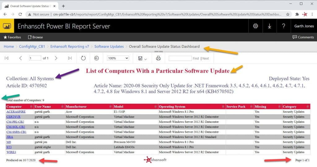
- Make sure you have a title and it is clear. This avoids any confusion when a report is exported, printed or viewed in interactive mode. When viewing a report in interactive mode (in Power BI Report Server and SSRS 2016 or later) and you drill down from a dashboard or another report, the breadcrumb link doesn’t change the name of the displayed report. You might not know what report you are looking at, so you’ll never see any of our reports without a title. (Gold Arrows)
Use Sub-Headings
- A sub-heading is a great way to describe prompt values. You know exactly what a report is showing you when you’re in SSRS, but if you share the report with your colleagues, they may not! That’s why we always use sub-headings. (Purple Arrow)
Add Useful Details
- Not everyone needs to know the number of pages in a report, but they will want to know when a report was produced or the last time the data was refreshed. We add a footer where all of this information is displayed. (Red Arrows)
Visuals Need Color
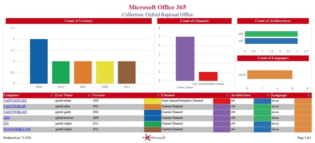
- Whether it’s a donut chart, a bar graph, etc., using color gives greater meaning to a report. In an instant, you know if something is good or bad. We purposely assign the same color to mean the same idea. For example, red = alert and green = good.
Always Include a Margin
- This is good to remember because when a report is printed, most printers do not print to the edge of a sheet of paper. Another factor to consider is interactive mode. Why? Some monitors cut off the first few pixels of a report, so it’s hard to read anything near the edges. In our case a ¼ inch margin saves the day! (Green Arrow)
Page Size Matters
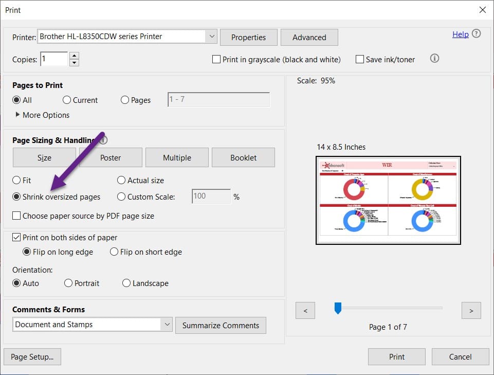
- We stick to a standard page size (Letter or Legal). It can be challenging to limit the data in a report, but it forces us to think critically about what is actually needed versus “nice to have.” This might seem like a trivial item until you have to read an exported or printed report. If you have a defined page size, then it ensures that a report is not chopped-up awkwardly. Just by following this tip, you’ll never need to tape a report together in order to view the details.
- In our Power BI reports (both Desktop and Report Server) we leverage the 16:9 ratio page size which also happens to be the default page size. When exporting a Power BI set to PDF, this ratio (16:9) is close to a 14 x 8.5 page size. All you need to do is use the Shrink oversized pages option within Adobe Reader to ensure that the report fits nicely on a 14 x 8.5 page.
Tables Are Important When Talking About Report Standards
We also have guidelines that are specific to tables. Again, here are some examples of what we use in our dashboards and reports, and why each item is important.
- Alternate the Color of Each Row
– This simple trick makes a report easier to read. - Use Interactive Sorting
– When you enable interactive sorting, the end-user can sort any column in a table. - Match the Color Found in the Visual
– Simply by adding a column that displays a color, you’ll make it easier for an end-user to find the details of what they see in the visual. - Use the Expand/Collapse Feature
– Don’t clutter your report. Sometimes you don’t need to view all of the details at once. - Enable the “norow” Option
– Use this feature to display an appropriate note. This is especially useful if a query returns no result. It tells the end-user that it isn’t a mistake within the report.
Helpful Guides
Are you looking for help with creating your own SSRS or Power BI reports? We have a lot of step-by-step blog posts. You’ll find below a sample of some of them. Or, better yet, sign-up for Enhansoft’s monthly newsletter, where each month we provide tips and tricks to help you get started. Don’t forget to follow us on Twitter in order to stay up-to-date with our latest blog posts!
Different Report Styles
Set the Page Size of SCCM Reports
Finishing Touches: Adding a Row Count to Your Report
Four Little Reporting Tips with a Big Impact
At the end of the day, a dashboard or report is considered successful if you can use it without any explanation and it is obvious what is being displayed. Also, a report’s usefulness is measured by how the information is shown. Is it displayed in a meaningful way? Can you interact with the details found in it? Remember to keep all of this in mind when you create your own custom reports.
Enhansoft’s Dashboards and Reports
Why choose Enhansoft for your reporting needs? We make it easy for you to get the details from ConfigMgr that you need right away. Instead of spending time on creating and testing queries, and designing reports, you can focus your time on more critical IT work.
If you have any questions about Enhansoft’s report standards guide, please feel free to contact me @GarthMJ.